Monday, May 29, 2006

World Cup 2006 Germany
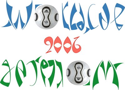
With the football fever grabbing us all, it was bound to be reflected in my artwork on this blog. So here it is, ambigram dedicated to the FIFA World Cup 2006, Germany. Starts june 9th. My favorites are Brazil. Which is yours? do comment!


The ambigram has been given a funky look, and the official football (designed by Adidas) is being used as O/A for a more effective presentation.

Friday, May 26, 2006

Mayumi

This ambigram was commissioned by Marcus Vinicius for Mayumi. Herein, I'm using a signature designed by Nagfa.


The design is minimal and is inspired by Langdon's ambigram for 'minimum' showcased in his book 'Wordplay'.

Thursday, May 25, 2006

My Ambigram by Nagfa

This ambigram was created by Nagfa for me. Thanks a lot. In the past couple of months, i've made so many ambigrams, but have never been able to make a satisfactory ambigram for my name. And here it is, a gift from Nagfa...so very gorgeous. I think i'll use it as my signature :)

Nagfa's ambigrams are so very cool, and they churn out almost 3-5 every day. I really like their blackletter, gothic and death metal inspired fonts.

Friday, May 19, 2006

Rohan & Amber

This is a symbiotogram of Rohan and Amber. It was requested by a dear friend of mine, Rohan, who wanted to dedicate it to his girlfriend Amber. I have used a naughty version of the blackletter style....for these love birds... :)


May this artwork bind you both more than ever...

Thursday, May 11, 2006

My alma mater

This is a symbiotogram of FOE/DEI. It is dedicated to my alma mater - Faculty of Engineering (FOE) - Dayalbagh Educational Institute (DEI) University from where i had graduated last year in electrical engineering.


It was requested by my juniors who wanted something whacky for their college t-shirts...so here it is. cheers guys!

Wednesday, May 10, 2006

Shweta

For a friend and ambigrammer - Shweta Saraf (another one for da ladies!). I think she'll like it. :)


It is inspired from blackletter and hindlewood font. The implementation of T-e/h was the most difficult part.

Tags - , , , , ,

Saturday, May 06, 2006

Neha

This ambigram is dedicated to Neha Ramchandani, a sweet girl i came across on Orkut. I hope she likes it. :)

I have been incorporating shadows in the ambigrams for some time, since it lends a bit of asymmetry to the ambigrams. A small asymmetry enlivens and energizes the word. The viewer is attracted simultaneously by the placid beauty of the dominant symmetry and the minute asymmetry (just like a tiny mole on a woman's face enhances her beauty a lot otherwise flawless beauty seems an artifical creation...). Absolute symmetry is lifeless.

Friday, May 05, 2006

Me and myself with 2 symmetries

This is me - Roopak. Both mirror and upside down symmetries incorporated. K had to be written in reverse. After having dedicated numerous ambigrams to so many people, i thought i needed one for myself. So here it is - a double ambigram created by me for myself.

Its remarkable that a word can be designed in such a way that it can be read from more than 2 vantage points.
I'd been really busy this week in office...which is why there hasn't been any update.